You’ve seen it before. One day, your favorite brand unveils a fresh new logo, and suddenly everything feels… different. Cleaner. Bolder. Maybe even a little more grown up.
But why do big brands change their logos? And how often does this really happen?
Let’s explore the timeline of logo rebranding – and what we, as business owners, creatives, or curious consumers, can learn from it.
Why Brands Redesign Their Logos
A logo is more than a pretty mark. It’s a symbol of everything a company stands for. But as times change, so do businesses. They grow. They pivot. They adapt. And their logo must reflect that evolution.
Here are a few common reasons why big brands change their logos:
- Modernization: Design trends change. What looked sleek in 2008 may feel outdated today.
- Digital Optimization: Logos need to look good on mobile, web, apps – even smartwatch screens.
- Repositioning: A new target market, a new mission, or a product shift can call for a visual reset.
- Mergers & Acquisitions: When companies join forces, their identities often merge too.
- Reputation Refresh: Sometimes, a clean slate is the best PR move.
In the words of Ogilvy himself: “If it doesn’t sell, it isn’t creative.” A logo, too, must sell the brand – subtly, effectively, and without saying a word.
How Often Do Big Brands Change Their Logos?
There’s no strict schedule. But patterns do emerge.
Tech Companies: Every 5–7 Years
Think of Google, Uber, or Airbnb. These brands are built in fast-moving industries and often refresh their look to stay ahead of the curve.
Consumer Goods: Every 10–15 Years
Brands like Pepsi and Coca-Cola take their time. When they change, it’s deliberate, calculated, and often part of a larger global campaign.
Fashion & Luxury: Subtle Tweaks Every 10–20 Years
Names like Burberry and Gucci rarely overhaul their logos completely. But they do evolve – quietly, elegantly.
Startups & Modern Brands: Every 2–5 Years
In the early years, startups experiment. They grow fast and so do their visual identities.
Real-World Examples of Logo Rebranding
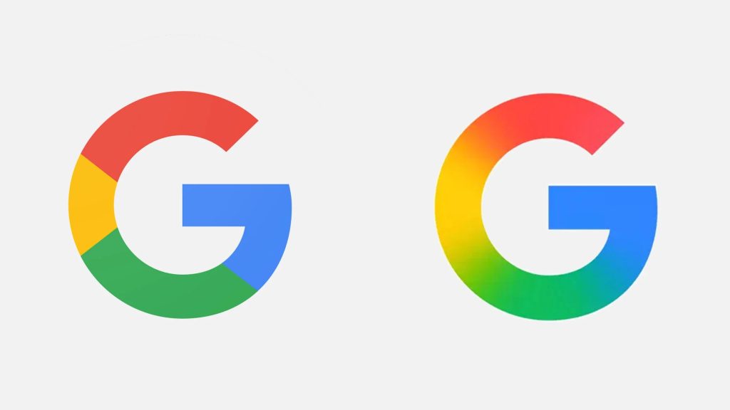
- Google changed its logo in 2015 – switching to a sans-serif typeface to align with its playful, digital-first identity.
- Pepsi has redesigned its logo multiple times, approximately every 10–15 years, with bold moves that reflect generational shifts.
- Instagram stunned the internet in 2016 by replacing its vintage camera icon with a bright, minimalist gradient. It was controversial – but memorable.
- Burberry, a British luxury house, rebranded in 2018 and again in 2023, signaling a return to heritage with a modern edge.
Each redesign wasn’t just a design decision – it was a business one.
So, When Should You Consider a Logo Redesign?
If you’re asking the question, it might be time.
Look at your current logo. Does it still represent who you are? Does it work across platforms? Would you be proud to wear it on a T-shirt?
Rebranding isn’t about chasing trends. It’s about clarity, confidence, and connecting with the people who matter most: your audience.
Final Thought
Big brands change their logos. Not because they’re bored – but because they know their identity must keep up with their ambition.
If you’re building something meaningful, don’t be afraid to evolve. And when you do, make sure your logo is part of that story.
As Ogilvy might say – “Don’t bunt. Aim out of the ballpark.”